
Bacchus Tarot Deck Review
Creators: Giordano Berti, Luigi Scapini, Guilia Scapini
Publisher: Dal Negro 2006
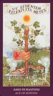
The Bacchus Tarot is a large-size art deck inspired by the god of wine: Bacchus to the Romans, Dionysus to the Greeks. The major arcana show the events and adventures of the life of Bacchus, the suits illustrate aspects of the industry of wine-making, and the court cards represent the major wine-making countries. From the creator of the Medieval Scapini Tarot.
Retailers
This deck is rare or out of print and isn't easy to find. Search for it on eBay or Amazon.com, or browse our most popular Tarot decks.Bacchus Tarot Review by Stephanie Lynch
This deck was a mixed bag for me. My first impression was not favorable. I strongly didn�t like the Fool card. Then as I studied it more, I realized that this interpretation did suit the message of the Fool. A man seemingly reacts unwisely to the trauma around him. He rages at the heavens instead of stepping away from a serpent or dealing with the nails in his legs and feet (very reminiscent of the Christ avatar.)
The illustrations are soft rather than sharp with almost a watercolor effect to the overall hue. The Queens are striking to me and stand out as the best of the deck overall. As I went through the cards one by one, I started to see the themes the creators are going for.
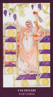
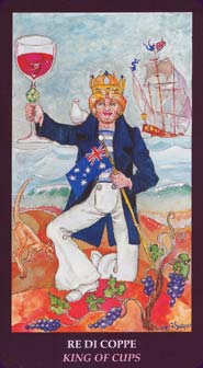
Obviously a deck for Bacchus would revolve around wine. Each suit is dedicated to a particular part of wine making such as the agricultural efforts. Each court card is dedicated to one of the top winemaking countries in the world. Once I realized this, the Asian Queen of Rods made perfect sense.
The real treasure for this deck is the not so little and not so white book. It does fit into the oversized box (these cards are large), but it is red in color. Each card comes with a description as well as the mythological tie-ins for the Major Arcana. Some of them are very obscure myths but I think the incisive remarks give enough for anyone to understand.
I recommend this deck with some reservation. Be prepared to get to know these cards. Do not expect �normal� cards although some are so similar to the standard of the Rider Waite deck that they have no life of their own. If you are a fan of a deck that will make you read and study other sources to learn, then this deck will suit you.
Bacchus Tarot Review by Nisaba Merrieweather
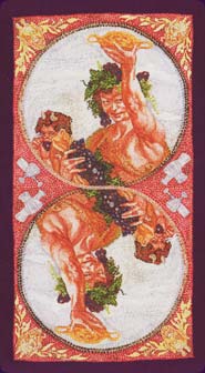
For various reasons I'm a bit of a fan of Luigi Scapini's artwork, and this is a deck from his stable that I have owned for a little while, but have neglected until now. The larger-size cards, about as wide as a playing-card is high and the highest of all Tarot cards I've seen excepting the US Games Visconti decks, are presented in a bright-red box and are themed, as you'd expect, around the fruits of the vine. All of the images are bordered in a darker, burgundy colour not far off the colour of a red wine, and not a single card in the entire deck misses out on having bunches of growing grapes somewhere in its design even if, in cases like The Star, they are subtle and almost hidden in the design.
The box is the first I've seen where the front of the box shows the front of a card - in this case, the execrable Hermit - and the back shows the actual cardback design: a lovely faux-mosaic image, a figure-eight or lemniscate with Greek dramatic masks on the outside as accents and a salacious male nude raising a cup in a toast with a demon chuckling nearby, reversed in the opposite loop of the lemniscate.
Let me warn you now: this is not a deck for the faint-hearted. If your style leans towards rainbows and dolphins, you will absolutely find this deck challenging. Likewise, if you have issues with alcohol or have lived for any length of time with someone who does, this deck will challenge your darknesses in the worst possible way. Trust me on this one: I collect Scapini decks so I would have bought it eventually, but I bought it specifically to challenge me as a part of my recovery. All of that being said, it is visually stunning, with pre-Raphaelite and classicist influences, strong lines and design, and a great use of colour and structure.
One thing I do take in interest in, especially with collaborative decks, is the signature. In this case, there are some decks signed "Guilia Scapini", some signed "Luigi Scapini", some signed "Luigi Scapini Guilia Scapini", some signed "GL Scapini", and some signed "LG Scapini". Looking at the ones with the first two signatures the differences in their artistic styles becomes apparent: Luigi has the rich colours we're used to on a Scapini deck, the strong lines, the bony figures. Guilia likes a more graceful, less muscular body-shape, paler colours, a lot of white left in the backgrounds of some of her images, and in a few cards, colour applied in watercolours and "bled", as watercolourists would call it, by applying water to the image before it dries. It is interesting to look at the cards signed either with both their names or both their initials, and work out who contributed the most stylistically to them: with the initialled cards, it is the partner whose initial comes first. Even if they had no interest in Tarot at all, art lovers would adore this deck.
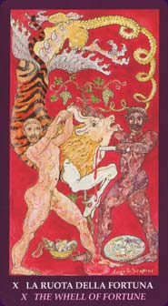
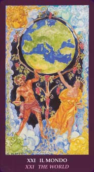
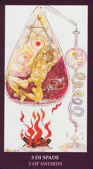
Some cards beg for special mention. Over a watercoloured sea, Guilia has placed a woman curving towards another, emptying a crown of stars out of a jug to crown her with, in The Stars. The Moon is testosterone-driven: a bearded man nursing an unconscious young boy whilst sitting with his feet in a pool and a red cape over his shoulders: the water is red, whether from the boy's blood, the reflection of the robe, or spilled wine, one cannot tell, whilst behind them on a hill, his horns surrounding the bloody Moon, a rampant bull bellows, his scrotum dangling down to his knees. The World is rich and opulent: coloured clouds like "bows and flows of angel-hair" surrounding a couple holding between them a living grapevine that reaches up into an arc containing the World. Strength is interesting: a Crone encouraging a bearded tiger that looks as decrepit as her, to lick a little boy. The "wheel" in the Wheel of Fortune is only an idea, made up of moving bodies both human and animal. The sky in the Tower is a dripping rain-giant, a woman on the balcony on fire, a baby thrown out lying down below. I love the sour-faced cat ignoring the hopeless drunk in the Five Cups, and the alchemical image of a man being boiled down in an alchemist's retort with a heap of red grapes. The one card that doesn't really seem to fit despite the deck's evident multiculturalism is the Geisha as the Queen Wands. There are a number of people whose health has obviously been negatively impacted by health in this deck including notably the Two Coins and the Page Cups, but the image on the front of the box, the Hermit, naked, reddened from circulatory damage, quaffing red wine and spilling it over himself and straddling a dead donkey (!) while a faun stalks him is in my opinion unrivalled in its impact by anything else in the deck.
This is a deck that sings about the social and festive qualities of wine - and the darker, damaging, cruel aspects of any kind of addiction in general and alcoholism in particular. To someone who has lived with someone completely controlled by alcohol who later degenerated into daily violence, this deck is appalling and awesome, wonderful and hideous. I strongly recommend that anyone and everyone get a copy. Then put it away until you are strong enough to face some of its more challenging messages.
Complete Details of Bacchus Tarot
Also known as Tarocchi di Bacchus
Creators: Giordano Berti, Luigi Scapini, Guilia ScapiniPublisher: Dal Negro 2006
Deck Type: Tarot Deck
Cards: 78
Major Arcana: 22
Minor Arcana: 56
Strength is 11
Justice is 8
Card Language: English
Rating: 14/20 or
Similar Decks to Bacchus Tarot
Category: Large-Size Tarot DecksCreator: Kabbalistic Visions, Medieval Scapini Tarot, Shakespeare Tarot, Tarocco delle Vetrate, Tuffo nel Mistero by Luigi Scapini Dante Tarot, Golden Tarot of the Renaissance, Initiatory Tarot of the Golden Dawn, Pictorial Key Tarot, Tarocchi di Robot, Tarot of the Angels, Tarot of the Druids, Universal Wirth Tarot, Venice Tarot, Visconti Tarot, Visconti Tarot Mini by Giordano Berti

< Previous Deck · Back to Top · Next Deck >
Home > Tarot Reviews > Bacchus Tarot Review
