
Major Tom's Tarot of Marseilles (2nd ed.) Deck Review
Creators: Thomas Schick
Publisher: Schiffer Books 2007
This is the second edition of Major Tom's Tarot of Marseilles, published by Schiffer Books and accompanied by a 96-page book. Major Tom's deck updates the Marseilles by giving the major arcana and court card figures modern dress and costumes.
Retailers
See Price at Amazon.comSee Price at Amazon.co.uk
Major Tom's Tarot of Marseilles (2nd ed.) Review by Kate Hill
�Major Tom Schick's inspiration for his modern Marseilles cards was the historical French style of cards, known in English as the Tarot of Marseilles and dating back to the early eighteenth century. His concept was the remain as true to the Marseilles iconography as possible, while translating their dress from the medieval European style to what they could be wearing today - and making it more relevant and accessible to a modern audience.� � review of first edition
Previously published in a small limited edition run of 50 copies during the 2005 Melbourne International Tarot Conference, Major Tom�s Tarot of Marseilles has been picked up by new Tarot publishers, Schiffer Books, for its second and more extended print run.
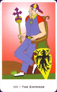
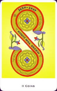
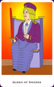
Tom�s colourful and contemporary Marseilles images have been updated in some small ways for the new edition. In outline they are very similar, but background colour blends have been refined and there is the odd refinement in symbolic colouring (for example, the Emperor�s previously red and yellow cap is now royal purple and yellow; similarly the Queen of Swords now wears purple and blue). The titles, previously inset at the base of the card scene, have been moved to the base of the outer white border. As you�d expect, there are also changes to the Two of Coins to update the date, and the Two of Cups to update the publisher�s name.
The major addition in the second edition is the companion book, also written by Major Tom. The 96-page companion book is roughly booklet size - the same dimensions as the cards � but is properly a book in my opinion. It is properly bound, with a cardboard cover and colour illustrations of the cards on its white pages.
For the meanings, Major Tom provides just enough to get you started. For the trumps, this is a description and �an idea of what the card represents�, underneath a full colour image of the card. The pip cards have no traditional associations, so you can either use your own with the deck or the suggested keywords that Major Tom collated in his tarot classes, and the courts have short descriptions of the card image and the costume. At the back of the book is a condensed course in tarot and doing your first reading. Throughout the book, Tom�s approach is totally non-dogmatic and he stresses doing what feels right for you.
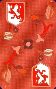
Along with the 78 tarot cards, there are two quick reference cards, The Numbers and The Colors, with a few keywords on each to help with interpreting the imagery (this info is also in the book). The backs of the cards have a very similar shield and floral design to the first edition, though printed here in red and white instead of greyscale.
The cards and book are nicely packaged in a sturdy, laminated cardboard box. Schiffer might be new to tarot deck publishing, but I have no complaints about either their choice of decks or choice of packaging! It�s nice to see a solid outer box that protects the cards and won�t go scruffy around the edges as quickly as a regular outer box. This one also differs by opening at the front like a door, the inside angles reinforced with red ribbon. The �door� is also made in such a way as to click satisfyingly shut and so the cards are safely held inside.
The second edition of Major Tom�s Tarot of Marseilles is a polished production, solidly packaged and beautifully printed. The limited nature of the first edition meant it was difficult to secure a copy, but if you weren�t lucky enough to pick up the first edition (or even if you did!), this special deck and book is now within the reach of everyone.
Major Tom's Tarot of Marseilles (2nd ed.) Review by Bonnie Cehovet
The deck under review is the second edition of Major Thomas Schick�s �Tarot of Marseilles�. The first edition was a Limited Edition of fifty decks published for the 2005 Melbourne International Tarot Conference. I personally thank both Major Tom (as he is known on Aeclectic Tarot) and Jean-Michel David (of the Association For Tarot Studies) for making the first edition of this deck possible. From that admittedly rough edition came the second edition, published by a relative newcomer to the Tarot world, Schiffer Books.
I don�t know why it has taken me so long to get to this deck � I have no reason. I will say that I am happy to be working with it now, as I deeply admire Major Tom Schick, who is not only a well-known presence on Aeclectic Tarot, but a knowledgeable, courteous individual who goes out of his way to share his wisdom and encourage people.
This is a 78 card deck, created along the lines of the Marseilles decks of the past. In his introduction Major Tom does credit to Tarot history. He also notes that his impetus in creating this deck was to reintroduce the Marseilles style to the English speaking world. The changes that he has introduced are twofold: (1) he updated the clothing the figures wear to that which would be seen in the 21st century, to make is easier for people to bond with the deck, and (2) he used gradient backgrounds (through Paint Shop Pro 8, which was also used to provide the colors).
I found it very interesting that the only figure to wear a crown was the Empress, and that the ubiquitous baseball cap is seen in lieu of all of the other crowns. The cards were drawn in 4H pencil on A4 size paper, inked with a ball point pen, and then scanned into the computer. All attempts were made to retain the wood-block feel of older Marseilles decks.
In his companion book, Major Tom talks about the spectrum of thought for meaning for the cards of the Tarot, going from an �assigned set of meanings� to �intuiting meanings� from what attracts one�s attention during a reading. His attempt in his companion book is to give the reader a minimum meaning, so that the cards can be used.
Major Tom suggests something that not everyone will want to do � and that is to start out with a study partner. The second thing that he suggests is to start a journal, which I heartily concur with! There are charts listing associationf for both colours and numbers.
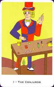
The cards are presented with small coloured scans (which really catch the eye!), and a short paragraph about the card. For example, for the Conjuror (Magician), we read the following: �Dressed in the top hat and colourful suit we associate with the circus, sideshow or fairground. He could be running the shell game or selling the latest gadget. �It slices, it dices, but wait until you see this!� He represents an act of will or making something happen.�
The Pips (numbered cards) are presented with a coloured scan, in like groups � i.e. all Aces together, all Two�s together. They are presented with keywords only. For example, from the book:
Fives:
Batons: strife, conflict, blowing off steam, cooperation, working together
Cups: loss, regret, need to move on, gratitude
Swords: domination, hollow victory, defeat, a bully
Coins: poverty, beliefs about resources, missed opportunities, the need to ask for help
The Court Cards are presented the same as the Major Arcana � with a full colour scan and a short paragraph about the card. From the book, we have the following: �Valet of Batons � This card traditionally has no title and shows a man dressed as a tree surgeon. It appears as if he has trimmed off a branch, which he now holds to offer to you. This Valet offers you the chance to learn something new.�
Note: On reversals, Major Tom states that he believes that the card itself contains all of its potential meanings, whether upright or reversed.
In his section on doing your first reading, Major Tom refers to the Tarot as an operating manual for a human being (very James Wanless here!). Reading the manual is all about learning to be yourself. Instructions are given on calculating your birth number, which Major Tom refers to as your soul card. He also addresses mediating with the cards.
I dearly loved the humor in his FAQ (Frequently Asked Questions) section, which was divided into two parts: questions that have the same answer, and questions that have different answers!
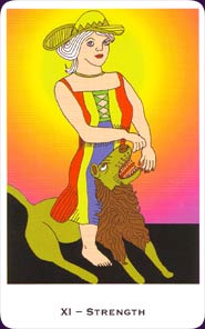
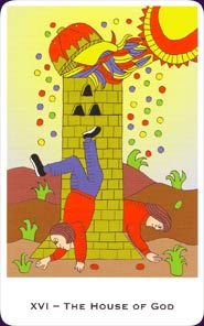
The structure of this deck is traditional Marseilles style. The Major Arcana retain their same titles, with the following exceptions: Conjuror/Magician, The Papes/High Priestess, Pope/Hierophant, Lover/The Lovers, the trump without a name/Death, and The House of God/The Tower. Justice is VIII, Strength is XI.
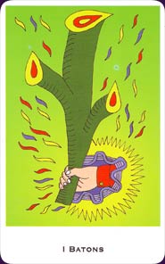
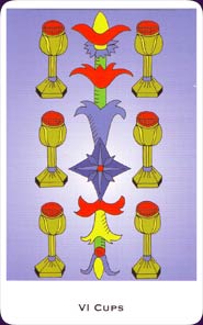
The suits are Batons/Wands, Cups, Swords, and Coins/Pentacles. The Court Cards are King, Queen, Cavalier/Knight, and Valet/Page.
The box that the cards and book come in is heavy duty cardboard, with a top that opens the long way. There is a lovely small ribbon that opens the box, and a second ribbon along the side to make sure that the top does not bend back too far. On the top of the box is a picture of the Conjuror, on the bottom of the box is a picture of the Pope.
The cards themselves are 2 �� by 4 ��. The backs have a reddish/brown background, with two heraldic shields, one at t he upper left hand corner, and one in the lower right hand corner. In the middle is a form of floral design. The card faces have a �� white border across the top and two sides, with a �� white border along the bottom. The Major Arcana show the card number, in Roman numerals, alon with the card title in black text along the bottom. The Pips show the number, in Roman numerals, and the suit in black text along the bottom. The Court cards show the card title and suit in black text along the bottom. There are two extra cards � one for Colors, and one for Numbers, with esoteric associations.
In traditional Marseilles style, the artists name and the date the deck was published are written on the Two of Coins. (In this case, the years 1650 � 2007 are noted, to credit the beginning of the Marseilles lineage.) The suit backgrounds are color coded � Batons are green, Cups are lavender, Swords are orange/red, and Coins are yellow/green. Odd numbered swords are depicted as straight, with the remaining swords curved.
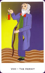
My favorite cards are the V of Batons, the X of Coins, Justice, The Conjuror, The Sun (I love those yods!), The Hermit (not to sure about those jeans � I think of this card in a more formal manner!), the King and Queen of Coins, and the II of Coins.
This is a wonderful deck for reading, meditation, and ritual work. It could be used with any age group, and people from any background. It will appeal to those looking for a Marseilles style deck, for an updated Marseilles style deck (two different things!), for collectors, and for those looking for a gentle deck to work with.
© Bonnie Cehovet
Major Tom's Tarot of Marseilles (2nd ed.) Review by Nisaba Merrieweather
This deck, a modern MArseilles designed by Tom Schick, is a newcomer to my collection. The deck and miniature accompanying book are presented in an attractive butterscotch-yellow cigar-style box, glossy and well-made, that is held closed by hidden magnets and is "dressed" with both a hinge and an opening-lip of red ribbon, preventing finger-damage to the packaging. It is shrink-wrapped externally, but internally the cards are not shrink-wrapped which suits me well, I'm not a big fan of superfluous packaging. Very classy.
Within this are found the 78-card deck plus the accompanying booklet, in a lighter canary-yellow. The cards are slightly smaller than the booklet and box, necessitating an inset of plain cardboard to stop them rattling around, but even so, the sturdiness, convenience and intelligence of the packaging-design means that this deck and its book are less likely to be split from each other than most other sets. In fact, I have only one other that was as well-packaged with packaging lending itself to keeping the accompanying book with the deck, so well done Tom.
I am a Tarot reader by profession as well as by preference, and on the day that I received this deck I took it to work with me not to read with as I wasn't yet familiar with it, but to look through and get familiar with between clients. As it happened I had a quiet shift so I was able to spend quite a bit of time with it, and I formed a number of opinions that other potential buyers may be interested in.
There are a number of things I look for in a Tarot deck, especially an older-style deck. My first stop was at the Major Arcana, to see if 11 and 8, Justice and Strength, were in the older order or the post-Rider-Waite order. To my relief, Justice was 8, and Strength 11. In addition, the Major Arcana began with 1, The Conjurer (or Magician, in other decks). I was very happy with that, as card 0, the Fool, should rightly occur between XX Judgement (which Tom knew had two "e"s in it unlike a lot of other deck designers) and XXI The World. Unfortunately it didn't fall there as it does in earlier decks, but it wasn't far out, falling after the World, so by and large I was pleased.
Moving from the Major Arcana to the Minor Arcana, I was pleased at Tom's having arranged it not in suits but in number-order, ie, then first four cards were the Aces, the second four were the Twos and so on right through to the Court Cards. In my mind, this enabled the owner of this deck to work on a progressive level, and see the comparisons between the different elements (suits) and how numerical principles operate in them, before moving onto the next ones.
So much for initial impressions. Now we get to the nitty-gritty, and to some areas where I have slightly more mixed feelings. For a start, this deck calls itself a Tarot of Marseilles, implying to me that it was designed a couple of hundred years ago in a specific region of France. The two or three original remnants of Tarots de Marseilles have been heavily influential and instrumental decks, and Tom has been heavily influenced by their artistic style, so I can see why he uses the name, but in my opinion, and my opinion only, it would be more accurate to have called it a Marseilles-style deck. After all, what Tarot de Marseilles would have baseball caps scattered liberally through the deck, or women of influence with bare midriffs and legs carelessly open? So there are some anachronisms that will offend purists, but strangely, they didn't offend me even though I'm pretty pure as they come. I was okay with the deck, but I was of the personal opinion that it was inaccurately named: I would have preferred it called something like "Major Tom's Marseilles-Style Tarot". {Note: after writing that, he did in fact tell me that a title similar to that had in fact been considered).
One thing I do like about Marseilles and Bologna-style early decks, is the sense of roughness that comes from them being bulk printed with the only technology available in the day: woodcuts. It gives them a streaky, coarse feeling with crude cross-hatching rather than shading and a two-dimensionality that, all taken together as a visual style, removes the user from the sense of the ordinary, day-to-day world, into a more mythic landscape of the mind. In addition the men and especially the women in these style of decks are not attractive by any stretch of the imagination, and as most human beings, beautiful or not, feel less appealing on the inside, this makes them great tools for accessing people's inner realities. I like that Tom has respected this tradition and not tried to pretty them up as other deck-designers have.
A characteristic of Marseilles style decks is a limited colour-palette. In my Bologna, it is a couple of shades of pale brown (by doubling up layers for a darker effect) and touches of pale red and blue as highlights. In my old Marseilles, from memory, the backgrounds were all white, with black outline and cross-hatching, and printed areas of primary blue and red. A very simple palette. This Tom has in no way tried to emulate. Yes, he has strong, strident colours, and yes he has flat-colour making his figures float in two dimensions which is an appealing effect in its own right. But he has quite a broad colour palette, and strong background-colours in most cards, that does have fading and shading. This is not a deck for someone who likes muted colouration and sublety - this is a deck for a colour-addict who loves richness.
A lot of the character's faces and many of their bodies seem, at first, to be quite badly-drawn, with asymmetrical features, different-sized eyes, bodies whose centres of gravity are at stressful odds with reality. At second glance, most of them have an almost Thurber-ish quirkiness, humour and pathos to them, the little person lost in a big world, something Thurber was excellent with in words and sketches and Michael Leunig does extraordinarily well now especially in his duck-and-teapot work. This doesn't stop them being big archetypes - it just makes them immediately accessible despite their superficial oddness to modern minds, most of whom also feel adrift in the universe.
The Minor Arcana, in the tradition of pre-20th century decks, have illustrated court cards but unillustrated pip (numbered) cards. This actually works for me, especially in this deck. Tom has given lucid explanations of what the suits and the numbers represent, which develops in the mind of someone reading his system a cogent and workable system without the need of illustrations, letting the intuition run riot and pull up whatever images the reading calls for.
His background colours are a bit of a worry: Yellow, the traditional Magickal colour for Air (Swords) is the background for coins, which are earth and therefore traditionally green; Swords instead of being on a yellow Airy ground are on a Fiery red ground; Batons or Wands are on an Earthy green instead of a fiery red ground, and Cups, instead of being on a Watery blue, are on an Etheric purple. {Note: Tom Schick tells me, also, that to his eye and mind the background colour is a blue. It is quite possible my eyesight is deteriorating or my colour-perception is changing.] Magical purists such as myself will have to take a minute to adjust, but it is perfectly possible to work the colours and suits that way. The Major Arcana is much more likely to evoke strong positive or negative responses than the pip cards.
The Major Arcana cards I liked the least were the Papess, whom I saw as a bit of a middle-aged mutton-dressed-as-lamb slag rather than as a holy creature of instinct and intuition, the Empress who could have done with a bit of regal dignity (but the wings of whose throne were intriguingly like angel's wings to me), and the House of God (Tower) which was wonderful - except for its horrible baseball cap. Oh, and I wasn't much gone on Tom's idea that the Kings all had baseball caps because we see out leaders of today wearing them: I don't know what planet he lives on, but I haven't seen a single politician or truly influential entrepreneur who would be caught dead in one, only the occasional sports-star-turned-advertising-millionaire. That might work for the King Batons (Wands), but the others, I felt, were all a bit demeaned by this.
Cards I particularly liked were the Chariot, which a hugely heavy structure that two cat-sized horses couldn't hope to pull even if its wheels weren't in right angles to the direction of travel; Justice wearing an Australian barrister's wig and wide, aware eyes (so preferable to a blindfold!); the Wheel of Fortune at a most irregular angle that an engineer couldn't possibly condone; the Hanged Man falling into a chasm and with his hair pulled out from his head by an electrical field; Death having severed his own foot by accident, and screaming as he looks back at us; and the Fool being savaged not by the traditional dog, but by what looks like a slightly overfed and spoilt Russian Blue cat. This is somehow very appropriate: cats are at once much closer to the spirit world in their daily lives than dogs are, and much less friendly to humans as a whole (although often insanely attached to their own humans).
My overall impressions are favourable. If you are looking to buy an authentic older-style Tarot of Marseilles, this is probably not the deck for you. If you are looking to buy a deck for the modern world with good old-fashioned Tarot symbolism, kooky antique-feel artwork with odd modernistic effects breaking in, and a lavish use of buoyantly cheerful colour, this deck will appeal. And the packaging is superb - if you don't buy it for any other reason, buy it for the box!
Complete Details of Major Tom's Tarot of Marseilles (2nd ed.)
Creators: Thomas SchickPublisher: Schiffer Books 2007
Deck Type: Tarot Deck
Cards: 78
Major Arcana: 22
Minor Arcana: 56
Deck Tradition: Marseilles
Minor Arcana Style: Marseilles-Style Pips
Suits: Cups, Swords, Batons, Coins
Court Cards: Valet, Cavalier, Queen, King
The Fool is 0
Strength is 11
Justice is 8
Card Size: 2.91 x 4.49 in. = 7.40cm x 11.40cm
Card Language: English
Card Back: Postcard
Back Design: Reversible shield and floral design in red and white.
Companion Material: 96-page bound miniature companion book, with meanings for both trumps and pip cards. In English.
Rating: 18/20 or
Similar Decks to Major Tom's Tarot of Marseilles (2nd ed.)
Theme: Marseilles, ModernCreator: Major Tom's Tarot, Major Tom's Tarot of Marseilles by Thomas Schick

< Previous Deck · Back to Top · Next Deck >
Home > Tarot Reviews > Major Tom's Tarot of Marseilles (2nd ed.) Review
