
Aquarian Tarot Deck Review
Creators: David Palladini
Publisher: US Games 1970
Suitable for beginning Tarot users, the Aquarian Tarot deck is a different presentation of the traditional card symbols and suits of Rods, Cups, Swords and Pentacles. Originally published in the 1970s, it's been in print ever since.
Now available in a small-size tin edition!
Retailers
See Price at Amazon.comSee Price at Amazon.co.uk
Aquarian Tarot Review by Talisman
In her book, "Seventy Eight Degrees of Wisdom", Rachel Pollock relates the story of how in the winter of 1969-70 when she was teaching in upstate New York and it was 30 degrees below zero, she searched for weeks to find her first Tarot deck, finally locating one in a little shop in Montreal.
That's how it was back then. No internet, of course. Just a few years later, when I was searching for my first Tarot deck, I had no such problems. I found a little shop that had an enormous selection. They must have had half a dozen different decks. Let's see, there were probably several versions of the Smith-Rider-Waite, the Thoth, perhaps the Morgan-Greer, and the Aquarian Tarot by David Palladini, which I purchased.
The little white book, actually a fold-out, that came with the deck, first published in 1970 by Morgan Press, described the Aquarian as an "authentic interpretation of the medieval Tarot". Actually, of course, the deck is an interpretation of Smith-Waite. To give you another touch of the flavor of those times, the fold-out's introduction begins: "In this the dawning of the Age of Aquarius the Tarot cards are enjoying a revival of interest . . ." Although the deck does not seem to attract much interest, it has not fallen by the wayside, but is still being published by U.S. Games Systems.
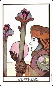
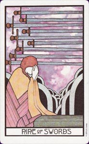
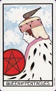
This is a "traditional" deck, consisting of 78 cards, 22 in the Major Arcana and 56 in the Minor Arcana, divided into four suits -- Cups, Swords, Pentacles, and Rods. There is a white border (in my old deck the white has turned a pale ivory) around the cards. In the majors the card title is worked, often elaborately, into the design and a Roman numeral tops each card. The minors are titled at the bottom of each card.
Palladini is a graphic artist, and the cards are designed in Art Deco decorative style. Art deco originated in the late 1920s and was derived from cubism and based on geometric forms. The style was experiencing a revival in the 1960s when this deck was created.
The colors have a muted, melancholy feel, as if seen by moonlight. This makes the occasional spot of bright color jump out, as in the Death card, which shows a close-up of a skeleton wearing a helmet and carrying a black banner with a gray rose, while in the distance a blood-red sun glows as it sets behind hills and two towers.
The minors are very much Smith-Waite, if you can imagine the camera dollying in close on the scene for a tight focus, and then the whole thing rendered in art deco style. The court cards are close up portraits. Faces are mostly shown as serene and thoughtful, lost in the world of their own contemplation, unaware that you are even looking at them. Many seem sad. Skies in this deck are often left white, but other times they are watercolored and often stormy, in soft and strange contrast to the rigid geometric designs.
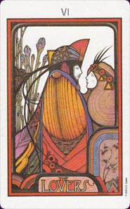
Palladini took greater liberties with the majors, although his preference is still for close-ups. We see the Hermit partially from behind, hooded, cloaked, and holding a lantern. The Fool is a close-up of a youth elaborately costumed with a plume on his cap, holding his staff and a white rose. He, too, appears lost in thought. The Sun is a round face with elaborate geometric rays. I always liked the form at the bottom of the card, which to me looks like an open book. The Star is a peacock with a strangely designed star in the sky. In the Lovers, the couples' elaborate costumes are so intertwined you can't tell where one begins and the other ends. In the lower right corner is what looks like a Japanese print.
One of my favorite cards is the High Priestess, shown contemplating a flower she holds in her hand. A butterfly is perched on a leaf of the flower. She wears a black gown printed with oak leaves, and a string of colored beads falls across one shoulder. Next to her are two scrolls, B and J. Behind her is a red veil printed with pomegranates, often seen as both a feminine symbol and a symbol of hidden knowledge. The veil is pulled back to reveal mountains in the distance, and a castle in those mountains. In front of the mountains is a lake, which reflects a path to the castle.
In 1996 Palladini published
a second deck, the New Palladini, which I find more
conventional and less interesting than the first.
Aquarian Tarot Review by Bonnie Cehovet
I had two immediate reactions to this deck: I disliked the blue/white backs as being too busy and distracting, and I was drawn to the style of the cards themselves.
The colors are soft and muted, the style very old world. There is a quarter-inch white border on all of the cards, with a heavy black line delineating the inner portion of the card. The courts and pips are titled at the bottom of the card, black on a white background. The lettering is very stylized, and distracting to me.
The portrayal of the pips and courts is fairly traditional, a la Waite, and so are most of the major arcana. My favorite would be the High Priestess - shown holding a single rose and gazing intently into it - clearly in another world, and quite ready to take us with her!
The majors are titled at the bottom in black lettering. The position of the title, as well as the size and style of the lettering vary, and again I find them distracting. (Perhaps I need to say here that Mr. Palladini is a graphic artist, and this is where the 'feel' of his cards is coming from.)
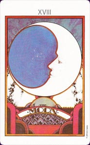
There are other majors that are much less traditional - the Moon, the Sun and the Star in particular. The Moon shows a large white circle with a face, which is fine, but then there is a large blue blob to the left of the circle - perhaps meant to convey the illusionary nature of the Moon, but the point never got across to me. The Star shows a peacock, above which is a stylized multi-colored star. Absolutely no sense of opportunity that is the Star.
The Sun is again very stylized - showing a large circle with a face in it and multiple bands of color radiating from it. Actually, this looks more like what one would think the Moon would be like.
Having said all that - I do find the Aquarian Tarot attractive, and readable. I think it would be also good for public readings.
© Bonnie Cehovet
Aquarian Tarot Review by William ReMine
The reviews of the various Tarots disclose a bias against the Rider-Waite cards and other decks, such as the Aquarian Tarot, that are derived from the Rider-Waite.� So, let me offer a suitable counterpoint.�
What makes the Rider-Waite and the Aquarian so powerful and enduring is the symbolism embodied in the artwork - a symbolism that evokes profound responses from the Unconscious mind.� I happen to prefer the Aquarian (as I have for the past thirty years) because the artwork is cleaner and contains some subtle touches that make the cards more meaningful for me.� One of those touches is the way the faces of characters in the cards tend to be somewhat ethereal, showing less of the underlying personality than the Rider-Waite.�
For me, there is more focus in the Aquarian Tarot on what the card as a whole represents.� But in the end, I like the system of the Aquarian, the Rider-Waite, the B.O.T.A., the Universal Waite because of the responses they evoke from the Unconscious.
Complete Details of Aquarian Tarot
Creators: David PalladiniPublisher: US Games 1970
Deck Type: Tarot Deck
Cards: 78
Major Arcana: 22
Minor Arcana: 56
Deck Tradition: Rider-Waite-Smith
Minor Arcana Style: RWS-Based Scenes
Suits: Cups, Penticales, Swords, Rods
Court Cards: King, Queen, Kight, Page
The Fool is 0
Strength is 8
Justice is 11
Card Size: 2.94 x 4.56 in. = 7.46cm x 11.59cm
Card Language: English
Card Back: Unknown
Companion Material: Little white booklet. A separate book, 'Psychic Tarot' by Craig Junjulas (published by U.S. Games 1985) is also available.
Rating: 16/20 or
Similar Decks to Aquarian Tarot
Category: Tarot Decks from the 1970sCreator: Aquarian Tarot in a Tin, Linweave Tarot, New Palladini Tarot by David Palladini

< Previous Deck · Back to Top · Next Deck >
Home > Tarot Reviews > Aquarian Tarot Review
