Dark Fairytale Tarot Deck Review
The Dark Fairytale Tarot is an exploration of the darker side of the world of the fae. It takes elements of both the Rider-Waite and Thoth foundations and blends them with lifelike medieval fantasy imagery.
Deck Type: Tarot Deck Cards: 78
Creators: Raffaele De Angelis
Publisher: Lo Scarabeo 2012

Retailers
See Price at Amazon.comSee Price at Amazon.co.uk
See Price at Amazon.ca
Dark Fairytale Tarot Review by Eeviee
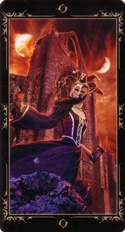
This deck is not a parody on your favourite childhood �Fairytale�. This deck is meant to be a deep exploration of the world of the Fey. The �fairies� of popular culture (think Tinkerbell), are nothing like the Faeries in Witchcraft and Paganism. They�re not all glitter and light; they have their �dark� or shadow sides like people. Do not be put off by the title; though perhaps it should read �Dark Faery Tale� Tarot. Do not mistake the deck for the sole image upon the box; the image is taken from The World card, the lightest and brightest in the deck. I assure you, much to my pleasure, there is no pastel pink gracing these cards!
This is the first deck I have seen that truly deserves the exclamation of being "hauntingly beautiful"! Overall the deck is coloured deep and dark, making minimal use of primary colours. Light is brought into the deck using natural light sources such as sunlight, moonlight, or by introducing an energetic glow. Despite being part CGI and having the "faces of people", this deck has a certain reality to it. Detailed attention is paid to proportions; highlights, transitions, and blending are used realistically. Nothing sticks out like a sore thumb, unless it is *supposed* to.
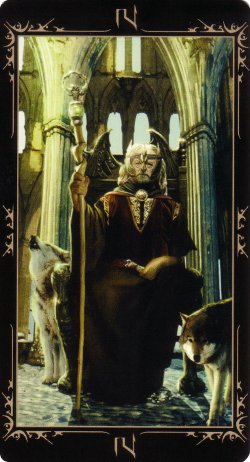
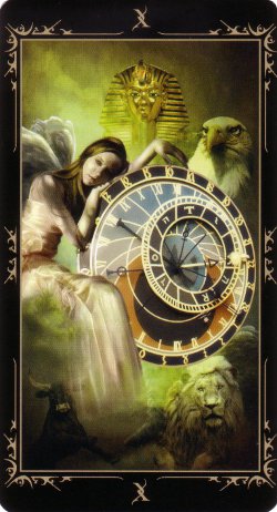
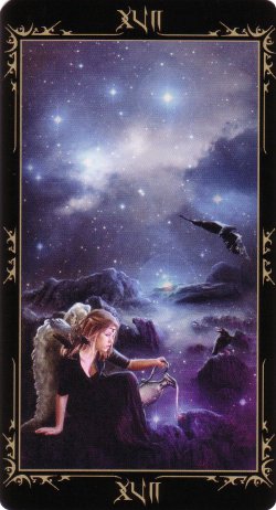
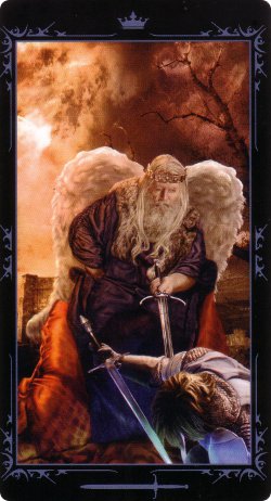
The artwork has a very Medieval/Renaissance/Gothic vibe to it. The backdrops are done either in scenes of Nature or using old architecture. These buildings are beautiful and breathtaking; reminiscent of cathedrals and churches. They are from a different time, elaborately decorated and intensely detailed. Graveyards are also featured, again, not with tombstones or layouts from this present era. The scenes from Nature are mostly of ancient woods with towering trees. There are some fields, rocky landscapes, and water locales. A few cards (ie. XVII - The Star & XXI - The World) depict a rather celestial scene.
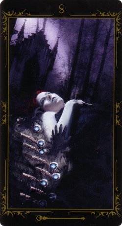
Throughout the deck there are certain images and symbols that repeat, regardless of suit or number. Within the deck, reappearing ravens/crows and human skulls make their way through the deck. There are reaching hands, often bound by chains, emerging from the ground. The Sun, The Moon, and eclipses, seem to play a special role. Different types of wings grace the cards; none are too like the popular "fariy" wings. -Some are feathered, like those of Angels, some are tattooed upon the characters' backs, and others are wisps; not fully formed. The artwork is a merger of both the organic world and realms of fantasy. The characters of the cards are dressed in Medieval/Renaissance clothing and sometimes in what I would call "glam Goth" fashion. Even a few vampiresque creatures make their way into the deck! -There are not many, for those of you put off by that statement.
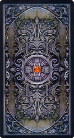
The card backs are "meh"; neither striking nor horrible. They are completely reversible, which is a plus for me, but others could care less. The image itself is very ambiguous; it could be a decorative panel in architecture or a tomb, or the top to a coffin or jewelry box. -Let your imagination wander! The colours are steel blue and tarnished silver; warmed-up by a red/orange brilliance-cut stone. Upon further inspection, it is a rather nice balance of masculine and feminine. The cold colours are offset by the warm-toned jeweled center. The equal-armed cross supporting the jewel offsets my initial "religious" vibe; turning it more Earth-centered. I love the scroll and fleur-de-lis type decor; and the flower-like corners aren't too... flowery. It has certainly grown on me, and I think someday I may be rather fond of it. The image fades into black, which make a nice transition into the black borders.
The card faces are also appropriately bordered with black, and do not contain the multi-lingual titles Lo Scarabeo favours. While a lot of people really like this aspect for what it is, there is actually a reason for it! -There are no "words" upon the card faces, making multi-language titles unnecessary. Each card is decorated with a colour matching it to its suit, with a thin outline of the artwork (separating it from the border) and some decorative embellishment that I can only describe as a perfect blend of points and curves. This embellishment is not over-bearing or exceedingly simple and simply "frames" the image of the card. The font used on the cards is a "script-meets-goth" that plays off of the "points and curves" in the embellishments.
The Majors are indicated by their Roman Numeral located at the top and bottom center of the card. The colour of this Arcana is done in a cream/cool beige. In the LWB, the Majors are all given the Titles of the RWS Tradition, though Strength is XI and Justice is VIII.
The Minors are the standard Cups, Pentacles, Wands and Swords (ordered this way in the deck and LWB). The Number of the card is indicated at the top center with an Arabic Numeral, and the suit by the traditional tool icon located at the bottom center. The Courts are given the titles and order of Knave (all are females), Knight (all are horse-riding males), Queen (all seated females), and King (all seated males). The Pips are numbered 1 (Ace) - 10 and contain scenic imagery, complete with appropriate number of icons. There are specific icons to represent the Courts, placed at the top center of the card. The Knaves have a mohawk helmet icon; a traditional battle helmet with a decorative topper. The Knights have a bust of a horse for their icon. The Queens have an icon of a delicate 5-pointed crown with I assume to be a jeweled-center. The Kings also have a 5-pointed crown for their icon, but with stronger features and points than the Queens'.
The embellishments on the borders of the suit of Cups are coloured in a burnt orange/ochre red, and its icon is that of a chalice. The Ace depicts a large grail with a blood-like content. Throughout the suit, the Cups are silver and are frequently decorated with an equal-armed cross. One of my favourite cards in the suit is the Queen, who lounges in a chair seemingly floating on the surface of a pond. Around her, glowing red/orange/yellow fan-tail goldfish swim around her in the air; leaving a red-glowing trail behind. I have to say that the King reminds me of the young Henry in the HBO show The Tudors.
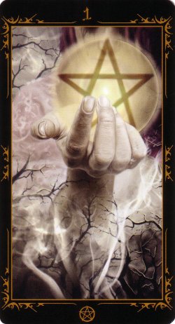
The suit of Pentacles border embellishments are done in a deep goldenrod colour and has the icon of a Pentacle at the bottom of the cards. The Ace depicts a hand holding a mostly transparent Pentacle; if you look closely, you can see the woman whose hand it belongs to faded into the background. The Pentacles are all golden; some plain and simple, some decorated with the Tree of Life, and others with Runes/Letters. My favourite cards of the suit are the 2 and 4 of Pentacles. The 2 of Pentacles has the best (in my own opinion) depiction of the standard RWS "juggler" I've seen: A woman stands with her eyes closed; red hair flailing up in wind; balancing the two golden glowing Pentacles, swirling with energy, complete with leminiscante; hands reach out from the rocky landscape; an ancient and ornate building looms in the background, with clouds and fog both nearby. The 4 of Pentacles is a new twist on the RWS; a man of power and creativity is taken aback, his back is arched, his face to the sky; two golden glowing Pentacles are at each of his feet, one levitates above his head; the fourth is seemingly on fire and begins to merge with his chest.
In the suit of Wands, the border embellishments are done in an olive green and has the icon of a pointed Wand with orb attached at the bottom of each card. The Ace shows two hands reaching to grasp a seemingly levitating Wand out of a graveyard. At first glace, the Wand is rather ugly; upon closer inspection it is intricately carved at the base in spirals. The top supports what looks like a stone; my guess would be opal or moonstone. There is a reflection within, but what it is of is hard to tell. The way the Wand is twisted and warped reminded me at first of a bone, upon further inspection it almost resembles a cobra. The Wands throughout the suit are not identical to one and other, but are similar; the base/shaft of the Wand is always wooden. Most are decorated with silver at the tops; those that are either have a glowing blue orb, or owls topping their green or orange orb. The 4, Knight, and King are the only cards to have all wooden Wands.
The embellishments on the borders of the suit of Swords are all done in a grey-blue and the icon at the bottom is that of a simple Sword (blade pointing left, handle right). The Ace depicts a woman balancing a red handled and glowing red bladed Sword; its point is downward and at the center of a silver crown. Blue fire seems to dance around the crown. most Swords depicted within the suit are simple in structure, made of steel/coloured silver. The Ace (1), 3, and Knight share a glowing red, almost lightsaber-like blade; 2, 7, and Page have glowing orange runes upon their blades; and the 9 of Swords is done with black handled, sliver bladed daggers.
The provided LWB (written by Lillie) comes in multiple languages, leaving only 13 pages for the English version. Lillie gives a bit of background on the deck, and provides a spread in the intro. The Majors are listed first, with a keyword next to the title, and a couple sentences about the meanings. Before each suit goes into detail, she provides a snippet about each suit. The number/Court of the card is listed followed by a brief definition. The LWB is by no means all encompassing, but provides more than some on the market today. I rather like it, for instead of providing upright/reversed or light/shadow meanings, she provides the situation in a rather ambiguous way. If you look closely, you can find the positive/negative meanings; but her style encourages you to look at the meanings as a whole. In about three sentences she gives you the idea of the card and provides a message and a warning.
Overall the deck is quite RWS-based,
taking some elements from Thoth. Not loving the RWS to
pieces and finding much sense in the Thoth tradition, I
find that this deck really blends the two together
well. This deck is darker than your average, but not
violent/gory/grotesque. I find it to be rather blunt and ambiguous as a
whole. It has quickly become one of my favourites!
Complete Details of Dark Fairytale Tarot
Creators: Raffaele De AngelisPublisher: Lo Scarabeo 2012
Deck Type: Tarot Deck
Cards: 78
Major Arcana: 22
Minor Arcana: 56
Card Language: None
Card Back: Reversible
Back Design: Ornate Celtic design with a red gem in the centre.
Rating: 16/20 or
Similar Decks to Dark Fairytale Tarot
Theme: Dark & Gothic
< Previous Deck · Back to Top · Next Deck >
Home > Tarot Reviews > Dark Fairytale Tarot Review