Fantastical Tarot Deck Review
A magical fantasy interpretation of the Rider-Waite. The Fantastical Tarot card borders are gold and cards are traditionally named, while the artwork style is unique, wonderfully complex, and occasionally gothic.
Deck Type: Tarot Deck Cards: 78
Creators: Natalie Hertz
Publisher: US Games 2004
Retailers
See Price at Amazon.comSee Price at Amazon.co.uk
See Price at Amazon.ca
Fantastical Tarot Review by Demonesse
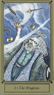
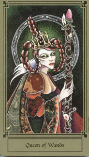
This review is for the Fantastical Tarot, which well deserves its name. At a glance, its beautiful gold border (with art deco detail in black) and lovely back - the famed reversible powder-and-aqua blue dragon against a field of deep blue, captivated me. It is the best card back I've seen thus far. (However, to my dismay I find the gold border easily chipped, especially at the edges, so handle with extreme care.) The cards are well-sized but slippery and it takes some practice to master them. The numbering and suit names adhere to the Rider-Waite, while Court Cards are Page, Knight, Queen and King. The names of the cards are at the bottom. The Queen of Wands is on the front of the Fantastical's box, and the Magician on the back.
As for the art, the Major Arcana is riveting - colourful, gaunt figures with closed eyes dance across the cards. Another thing worth noting is that some of them - Magician, Knights - have spirals tattooed on their faces and arms. I find the art beautiful, greatly detailed, and not without a touch of humour. This deck is a contradiction. When it's good, it's very, very good. When it's bad, it's not horrible or childish, but a pathetic shadow of what it could have been. Confused? Read on.
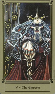
The Magician is my favourite card, done in shades of blue and gold - he hurls the four suit signs upwards and holds them in thrall, a claw reaching upwards while the sky swirls behind. Justice is equally impressive. While most Justice depictions are regal and cool and seem to carry themselves with the aura of Queens, she slumps against her sword; I found this one extremely evocative, especially in an age where true justice is all but dead. The Sun blazes with unleashed energy, and the Emperor is imperious, expecting your deference.
But they are often unrepresentative of their meanings, on the flipside. Take the Fool. He looks like something out of a nightmare - no na�ve youth here, but a mocking, simpering joker with a somewhat feminine posture, the body of an old tree trunk and nasty plans hidden behind his too-wide grin. There isn't even a cliff. To me the Fool is the most menacing card in the deck; he reminds me very much of the Vampire's Fool, especially since they share a similar creator in Nathalie Hertz. (Personally, and not from a general view, I like the Fool, because I like the gothic art style.) The Empress does not look fertile at all - compare her to the Mythic's Empress and you'd think of a barren winter moor compared to a summer field. Then again, gaunt figures are an art theme in this deck. They also often lack traditional symbols you have come to expect. The Tower looks ominous indeed, but lacks that all-important streak of lightning, and the High Priestess' peacock must have gone into the pot. Yet, without exception, they are all beautiful.
The Minors are not as successful, compared to the Majors. To me, the Minors must especially be representative of the meanings, whilst I can excuse a few creative liberties in the Majors purely because the Majors' meanings are easier to read (for me) but the Minors must be crystal-clear. For another thing, many are not well drawn, in artistic terms. For example, the Five of Pentacles does show two old men in patched jackets, but they have glasses of wine and a roaring fire - this is contradictory and they don't seem all that pathetic to me. The Ten of Wands, possibly the worst-drawn card in the whole deck, is an inconclusive-, indefinite-looking card to me. It shows a man simply standing between ten wands, depicting not at all the heavy, burdensome feeling of this card. Unfortunately, the artist seems to get lazy sometimes and draws far too many figures just standing (argh!) with the suit symbol - the Three, Six, Seven and Ten of Wands, for example.
Now for the individual suits as a whole. The Wands and Pentacles are a letdown. I like the overall look of the Wands, dark and rich, but the yellow-and brown Pentacles suit was a disappointment, the biggest fly in my ointment. The Wands look like carved staves with rounded ends, also bearing a similarity to the Vampire's wands. Pentacles look like shiny golden cymbals. I find I don't care much for the Pentacles, preferring the Pentacles to be more like something in the Londa Tarot - pentagrams.
However, the look of the Pentacles themselves doesn't bother me so much as the overall pictures. The Pentacles suit seems to lack detail - the representations of the meanings are weak (Six of Pentacles, lucky windfall? Looks like a sleepy old man to me) but the Eight is well done. One thing I DO like, though, is the way the artist has drawn the pentacles when they are being juggled - there is a floaty quality about them I like.
The Cups (colourful and bright) and the Swords (dark and cool colours) are the saving graces. Butterflies and green fields abound in the jeweled chalices of the Cups suit. The Four of Cups spells despair, and the Nine of Cups is truly a treasure trove worth of wishes. Have a look at the Ten, though. Are they really doing what I think they're doing? As for the Swords, they are gleaming sharp, while the figures here look even more gaunt than usual for the Fantastical. You feel so sorry for the man in the Five, and the King looks about to murder someone. The Three of Swords, however, is lousy. I would prefer the traditional swords through the heart.
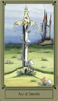
All the Aces and Court Cards are nice - I especially like the Aces, which show the suit symbol upright on the ground, and a field behind. The Knights, which, if are all pictured against a night sky (as Wicce notes on her site: nice pun on the knight/night thing) are womanly but have long beards ;) The Kings and Queens look distinctive and have a range of (mostly sombre) facial expressions, too. Take a look at the Queen of Wands' super-long eyelashes and fancy hairstyle in huge russet pigtails. As for the LWB, the Queen of Cups is on the cover. It gives two spreads (CC and Venus Spread), and is generally well-written, with short paragraphs on each of the Major illustrations, but some of the meanings given, especially for the Minors, clash with the ones I am familiar with.
In conclusion, I
like this deck. Very much. But I wish it could have
become THE deck, instead of slipping and sliding on its
way to gothic-inspired glory.
Fantastical Tarot Review by Michelle
What makes the Fantastical Tarot by Nathalie Hertz and published by US Games so fantastic? It is the unique images of this particular deck. There are the typical names of a 78-card Tarot deck, the Cups, Wands, Swords, and Pentacles. In addition, the court cards, Pages, Knights, Queens and Kings. This also, includes all the Major Acrana as well. However, what makes this deck different from any other deck is the images that represent each card. The brilliance of the colors and sometimes what is extreme or perhaps even more of a morbid, dark image of each card. For example, a skeleton holding a sye, with a dark background and deep red colors, depicts The Death card. The Death card in itself can draw feelings of fear and being unsure to some unaware by the meaning and only looking at the image on the card of this deck.
If one was to just look at the consistency of this deck, it does follow the normal format of 78-card deck in it is own unique style. When one takes the journey of the Fool in this particular deck, they travel down the enchanting road of sweeping dark images. Each one of the Major Arcana takes the reader deep inside the card like a black hole. Layered with a goldish brown border on each card, framing the card so that you look at what seems to be a snapshot of your feelings.
How does the Fantastical Tarot compare to other decks out there now? The Gilded Tarot, a popular deck right now, has its deep-rooted colors and linear images. It is a beautiful deck, but different from the Fantastical Tarot in that it has a happier dream like state, compared to the Fantastical that haves what seems to be a night mere. I have felt myself drawn to certain cards of the Fantastical Tarot. The Temperance card with her flowing hair and what look like water surrounding her makes me think of comfort, emotions flowing. This connection to the deck makes readings easier as well.
In readings with the Fantastical deck, the readings take on more of an intense feeling. The images present and the constant blue color, brings about the feeling that you were there. A certain calm feeling calms about when using these cards, even if the images are a tad darker than other decks. One may have to have a certain taste for this type of deck. However, the expansion of emotions that this deck gives out is well worth the experimentation with this deck and makes the Fantastical Tarot just fantastic.
Complete Details of Fantastical Tarot
Creators: Natalie HertzPublisher: US Games 2004
Deck Type: Tarot Deck
Cards: 78
Deck Tradition: Rider-Waite-Smith
Minor Arcana Style: Unique Scenes With Suit Symbols
Suits: Cups, Swords, Wands, Pentacles
Court Cards: Page, Knight, Queen, King
The Fool is 0
Strength is 8
Justice is 11
Card Size: 2.75 x 4.75 in. = 6.99cm x 12.06cm
Card Language: English
Card Back: Unknown
Rating: 16/20 or
Similar Decks to Fantastical Tarot
Theme: FantasyCreator: Faerie Tarot, Vampire Tarot by Natalie Hertz

< Previous Deck · Back to Top · Next Deck >
Home > Tarot Reviews > Fantastical Tarot Review