Golden Tarot of Klimt Deck Review
The Golden Tarot of Klimt is inspired by the artistic style of early twentieth-century Austrian painter, Gustav Klimt. The art is vivid and sensual, interspersed with mosaic patterns and accented with gold metallic accents.
Deck Type: Tarot Deck Cards: 78
Creators: A. Atanassov
Publisher: Lo Scarabeo 2005
Retailers
See Price at Amazon.comSee Price at Amazon.co.uk
See Price at Amazon.ca
Golden Tarot of Klimt Review by Kate Hill
"The symbolism inherent in the Tarot is perfectly coherent with that symbolist cultural that also gave origin to Klimt�s artwork. The pictorial images of the Viennese artist are, in fact, full of hermeticism: his works seem to be depictions of a mystery and even more so an expression of emotions and drives."
Gustav Klimt was an early twentieth-century Austrian artist who was known for the elegance, beauty and sensuality of his works. Klimt rejected tradition and the moralism of previous generations in his art, and is remembered because he �succeeded in perfectly expressing the spirit of the bourgeois and aristocratic world of his time, transforming it into a dream-like universe of magnificence and decadence�. He was also a Symbolist painter � which seems very appropriate for the adaptation of his art into Tarot cards.
Klimt�s art was influenced by diverse sources: medieval woodcuts by Durer, Japanese Ukiyoe paintings, Egyptian, Byzantine, Classical Greek and even Minoan influences. Photographical influences also seem apparent; the faces and often bodies have a photo-realistic quality in outline and expression. Klimt�s people are tall and spare, extremely elegant, and very pale. They aren�t restricted to the young and beautiful either; there are children, old people, pregnant women, fuller figured women, mothers, all in their pale humanity. Some of his images attracted accusations of pornography when they were first shown, because of the nude body and depictions of the natural human: the inclusion of bodies that didn�t fit what was thought of as �sensual� at the time.
A.A. Atanassov was inspired by Gustav Klimt�s style and created the cards for the Golden Tarot of Klimt from artwork spanning the artist�s career from 1899 to 1917. Some cards are close copies of his original paintings -The Moon card is a version of �Danae�, the Ten of Cups is �Jungfrau�, Strength is �Judith II� and the High Priestess in �Bildnis Frieda Reidler� - while others are of a similar feel but don�t directly match with a piece of Klimt�s.
The card art is rich and luxurious yet elegant and poised, offset by dramatic black borders. Gold and mosaics were common parts of Klimt�s works, and have been used in the Tarot deck to great effect - clothing and swathes of backgrounds are transformed by sensual reds, multi-coloured tiled mosaics, and glinting metallic gold highlights. The major arcana seem have a stronger connection with Klimt�s works, while the minor arcana are more Tarot illustrations in his style.
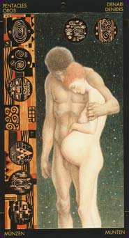
Of all the cards, my own favourites are the Sun, the Lovers, the Chariot and the Four of Wands. The Sun has a couple standing in a tight embrace, golden light streaming down behind them. The Lovers is an illustration from one of Klimt�s most famous paintings � The Kiss � a man bending over to kiss his lover�s face, their robes are a glittering gold mosaic. The Chariot pictures a naked woman with flowing brown hair atop a golden chariot, left arm raised with whip in hand, reins over her right arm, eyes closed. The Four of Wands has a strong feeling of peace and love: a woman stands, resting her head on the sleeping child in her arms.
The companion booklet is a standard one from Lo Scarabeo - it introduces Klimt and the concept for the Tarot cards, offers a few pages of keywords meanings (upright and reversed) and a unique spread. The meanings are somewhat disappointing � they explain nothing about the art choices or links between the card and art, they�re just bare divinatory keywords. For example:
XI � Strength � Spiritual energy, moral strength, clear thinking, determination. Dangerous confrontation, cruelty, uneven struggles, sacrifice.
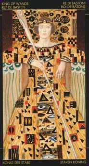
The suits used in the deck are Chalices, Wands, Swords and Pentacles, while the court cards are Knave, Knight, Queen, and King. The major arcana have the more traditional ordering of Strength at 11 and Justice at 8, and the minors are fully illustrated. Each numbered suit card shows the relevant number of suit elements, eg. the Ten of Cups shows ten cups, the Four of Swords four swords. The backs have a reversible busy Klimt-style design of an ornately-dressed woman.
The Golden Tarot of Klimt is a stunning deck of human beauty contrasted with luxurious costumes and surroundings. It�s definitely one for the art-lovers and deck collectors, but it could also be working reading deck. Novice readers might find the changed imagery and bare-bones companion material a challenge to work with, but readers with some experience could use it - once they have stopped drooling over the golden images.
Golden Tarot of Klimt Review by Bonnie Cehovet
In a word - this deck is stunning! Done in gold leaf, it is based on the art of twentieth-century Austrian artist Gustav Klimt. His work reflects the art and culture of early twentieth-century Vienna. Klimt left the "School of Arts and Crafts" in protest of his belief that painting and other figurative arts were not being given their proper worth (at this time, theater and operatic music took precedence with the Austro-Hungarian court).With fellow painters, he helped create a splinter group known as the Vienna Secession, whose aim was to promote Austrian art at home and abroad. Of these painters, Klimt stands out as perfectly expressing the spirit of the bourgeois and the aristocratic world of his time. His works created a dream-like universe that was both decadent and magnificent. He is considered to be one of the initiators of the tradition of modern design through his combining pictorial techniques and purely graphical techniques.
These are the works that inspired artist A. A. Atanassov to create this absolutely stunning deck. The gold leaf itself is mesmerizing, but the art that it enhances is also in a class of its own. The work is very stylized, with the figures appearing long and thin, bordering on seeming emaciated - the type of thing that one would see in a fun-house mirror. the skin tones are extremely pale, with the background colors tending to orange-red or shades of brown.
The deck follows the traditional structure of the Tarot, with traditional titles for the Major Arcana, and the placement of Justice at VIII and Strength at XI. The Minor Arcana suits are Wands, Chalices, Swords and Pentacles. The court cards are entitled King, Queen, Knight and Knave.
The LWB that accompanies the deck is in English, Italian, German, Spanish and French. It covers the biographical background on Gustav Klimt, a short section on the symbolism in this deck, and upright and reversed meanings for each of the cards. One spread is presented, a thirteen card spread entitled the "Circle of Faults and Virtues". Twelve cards are placed in a circle, with the thirteenth card in the middle. Part of the process here is that the Major and Minor Arcana are separated, with the first twelve cards coming from the Minor Arcana, and the thirteenth card from the Major Arcana. If the middle card is upright, the cards are read from right to left. If the card in the middle is reversed, the cards are read from left to right. The spread is read in a specific manner, with the first four cards being turned over, and then the card in the middle. The first four cards represent the Seeker's current situation, with the Major Arcana card providing the direction for reading the Minor Arcana. The second group of four cards represents the Seeker's job situation, and the last four cards represent the Seeker's emotional situation. My thought here, and I don't know why, is that this spread is representative of the energy of the times that Klimt was painting.
The cards themselves are approximately 2 5/8" by 4 3/5", of sturdy, glossy card stock with gold leaf. The backs have a 1/4" black border, with a patterned gold background. In the center, back to back, is the surrealistic impression of a female figure. It would be impossible to tell if the cards were drawn upright or reversed. The card faces show the same 1/4" black border, followed by a thin gold border. At the top of the Major Arcana is the card number, in Roman numerals, with the card title in five languages (English, Italian, French, Spanish and German) in small gold lettering in the four corners. the Minor Arcana show the suit number at the top, with the suit name, in five languages, in each of the four corners. The Court cards show the title and suit in five languages, in each of the four corners.
There were a few cards that I felt did not bring out the traditional energy of the card. the first one was The Fool, which shows a male figure, nude, standing with his head in his hands. Definitely not a youth setting out on his life's journey. What troubles me is that the card does match the upright definition given in the LWB: "Lack of points of reference, loss of identity, confusion". The Hermit to me was another version of the Fool, with a nude male figure standing, this time with his hands behind his back and his head down. This time to definition in the LWB does match what the archetype should be: "Solitude, meditation, reserve, wisdom".
Strength I really do not understand. Here we see a female figure standing, with what appears to be a male face on the lower left hand side of her skirt. The definition given in the LWB is: "Spiritual energy, moral strength, clear thinking, determination". This definitely does not come through in this card. The Hanged Man has lost the esoteric symbolism by having the figures arms held straight out in front of him, with one ankle bound and the other unbound, with the unbound knee bent out.
The female figure in the World is standing sideways to the viewer, and very, very pregnant. I am not sure from the look on her face if she wants to tell the reader something, or if she wants to know how she got that way. The Nine of Chalices is a real doozy, with a figure that appears to be male, but with enlarged breasts and a very pregnant stomach!
There may be some reason for all of the above, and if I were more knowledgeable in the area of art, they might have made more sense. The cards were breathtaking from an artistic point of view, but I don't know how I would interpret them in a reading, or explain them to a client.
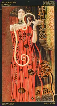
Having said that, there are some cards that absolutely shine! the Magician appears as a female figure, in a red dress with gold figures on it. In her left hand she holds a flat dish, while what appears to be a gold snake winds itself around her right arm, with its head poised over the dish. Her right hand appears to be held in a stylized, Hermetic type position. The High Priestess shows a very elegant lady, seated, with a book held loosely in her left hand. Again, both hands seem to be held in Hermetic positions.
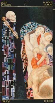
The Lovers shows a male and female figure embracing, with the archetypal intent showing clearly. Justice is a standing female figure, with the sword of justice in her right hand (a large sword - the hilt comes up to her shoulder), and the scales of justice in her left hand. I was rather drawn to Death, which showed Death with a pale face, carrying a scythe. To the right, in a a separate picture, we see a family of pale figures. The message here? Death is a part of the cycle of life - it comes to us all. Also very telling is that under the face of Death we see a series of crosses, making up a surrealistic 'body".
The Moon is one of my favorite cards, with a female figure, curled into a fetal position, riding on a moonbeam. The Sun is another favorite, showing two figures embracing in front of a gold background that features little sworls that look like peacock eyes. The Five of Chalices is humorous, yet right on target - a fully dressed female figure, standing, holding a pale mask of her own face in front of her. How many masks do we all wear in living out our lives!
The Ten of Pentacles is very much a "feel good" card, showing a bright yellow house through a canopy of green, leafy trees. All of the court cards served their purpose, with the possible exception of the King of Pentacles. Here we see the King seated, with his head propped on his left hand. His right hand holds the symbol for the suit of Pentacles, which rests in his lap. The manner in which he is seated, and the look on his face, is more Four of Pentacles that King of Pentacles.
This is a very well done deck, and a must have for collectors of art decks. It does contain a considerable amount of nudity, which is something to take into consideration when offering it as a possible deck for a client reading. While this deck could be used for reading, it is not a deck for beginning readers. It would work well, however, in working with the comparative method of reading. The artwork itself, and the gold leaf, make this a deck that is easy to appreciate.
Golden Tarot of Klimt Review by Nisaba Merrieweather
Well. Everybody needs a Bling Deck, and I suppose this is mine. The box is heavily inlaid with fake gold leaf, and so is every card. I suppose this kind of treatment is what I was expecting with I ordered Scapini's Mediaeval deck with its lavish use of gold, and was so disappointed to find that its gold had been approximated by brown printer's ink with orange highlights. No such treatment on this deck: card after card we have bling, bling and yet more bling! Given the presence of so much "gold leaf", perhaps it is surprising that the sides of the cards have not been gilded - it would have taken less time and exactitude than the gilding that is throughout the deck, and would have added to its sense of lavishness.
And lavishness is what this deck is about. Card after card, we see spoilt, rich people living out spoilt, rich lives. And after that sweeping generalisation, I have a few more to add: as well as being my bling deck, I have never seen a deck so sad: most of the characters; faces are showing various degrees of sadness, aside from a minority that show anguish, anger or in one case dullness. There are more characters in this deck with their eyes closed than with their eyes open: as a population, they seem not to want to see what is around them even in quite happy cards. Something else that unifies this deck is that most of the cards are in reds, oranges, yellows, tans and other warm shades, with the exception of most skin-shades which are usually an unhealthy greyish colour unless the artist is trying to make a point about vitality in which case they might be healthier, and with the exception of touches of cool colours often in fussily patterned clothes, and in one or two cases cool-coloured backgrounds, greens and blues and purples, that are somehow toned down and seem to fit. These is one card that is an exception to this: I'll come to that later.
This is also a densely populated deck: with the exception of the Ace Swords and the Ten Pentacles, every deck is full of people, sometimes very full of people, and even the Ace Swords has a hand holding the swords that is not, like the Rider-Waite hands, an airy-fairy hand coming out of a puff of cloud, but a real, human, individual hand, going right to the border of the card and explicitly stating that the rest of the person is just out of sight. And as I've mentioned Rider-Waite style decks, it is worth mentioning that this deck is neither a clone of the RW or the Thoth sets of symbolism - it exists on its own terms.
Another generalisation: I have never seen so much nudity in a deck before: there are a few cards with fully clothed characters, but the majority would feature nude men, women and children, old and young, sick and healthy, overweight and underweight, pregnant and not. Just today I got very politely asked in a cafe to put it away as the "pornographic" images were disturbing the other customers (no other customers were around me, but a waitress had passed the table a couple of times). Now, to me pornography is about titillation and arousal - there is not a single figure in this deck, male or female, that is the least bit provocative, and many are flatly undesirable.
The nudity works, not as pornography, but as a statement of human vulnerability in some cards, am "I don't care what you think" attitude in others, as a stark reminder of frailty, illness and age in yet others. At the same time, there are obviously healthy bodies: the women in The Chariot and the Moon are glowing with a health that is rare in this deck, and we are even looking up at the Chariot from below the front of the actual vehicle getting a good look at -er- everything, but it is STILL not an erotic card.
The artist either has a limited repetoire of faces, or has used a limited number of models when preparing this deck: there are certain faces you get to recognise as you move from card to card. There are three or four redheaded women, but there is one in particular who recurs, underweight and exhausted-looking, with huge hair, and in a couple of cases visibly pregnant. There is a dark-haired woman who looks rather like my friend Laura whom I saw at least seven times as I was flicking through the deck. There are a few men who recur, too, notably one muscular mixed-race man who seems to always have pulled the short straw, symbolically speaking.
There are a few cards worthy of individual mention - and obviously if you buy the deck, you'll have your own selection that you'll want to look at, but this is mine. I write the review: I get to choose. Death is interesting. To the left side of the card at the top of the card is a grinning skull and two bony hands holding not the traditional scythe but a crude, short wooden club, suitable for making big bruises on people. One end is thickened, like the ends of long-bones in the human body. To the right is a group of people of mixed age, race and gender, all obviously still alive but with their eyes closed, deliberately not wanting to know what is coming. Balancing that and under the skull and hands of Death, is what is obviously meant to be his robe. Picked out in blues, greens, reds, browns, gold and black, its fussy design is riddled with crucifixes. Death has a tooth missing - I only just noticed that. Did one of his earlier clients struggle, and punch him hard in an effort to get away? This bunch certainly are not struggling.
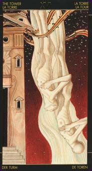
Judgement has no angels or trumpets, just a heap of people of mixed demographic and state of decpmposition, sliding down a steep slope which is detailed in gold, against a dead-red sky. The Seven Wands shows the ruthless slaughter of a helpless minotaur by - yes - by a sword, not a Wand. It is against a drab background with falling golden "snow", and surrounded by Wands. Have I mentioned how pronographic the naked figures are not? Well, the Wands are, to my mind, pornographic, at least slightly, enough for me to be uncomfortable spending any time on them. To me, they all seem like semi-erect uncircumcised penises, just beginning to emerge from their foreskins.
The Seven Cups has seven totally different Cups, but keeps well away from the minefield that most other decks get into, of having different things or scenes emerging from each cup. Strength is a strange image: framed as many of the images in this deck are by gold-decorated pillars, she is topless and struggling blindly with her full skirts, out of which an unconscious head is emerging, the fingers of her left hand woven through the hair, as if she doesn't know it's there. The Moon is one of the very few healthy nudes: a plump redhead, she is unconscious, curled up in the foetal position, resting partly on a whoosh of light and tiny crescent-moons that spirals through space.
Then we come to a few images that seem a little inappropriate to me: the Two Pentacles shows a healthy-looking nude woman feeding two naked toddlers, a white girl and a dark-skinned boy, an images I would have thought was more in keeping with the Six Cups. The Queen Pentacles has a giant Pentacle behind her head in the manner of Mediaeval and Renaissance halos in Iconic religious art, but her face has an expression of stupidity and hopelessness in it. The World shows the recurring redhead again, enormously pregnant and dangerously underweight, standing in front of drapery and looking at us with deep suspicion in her face. The Three Pentacles shows a musician playing a lyre which is fine - but in the middle of a barren desert? And the Two Swords shows two nude men, both with their eyes shut, locked in an embrace. Are they expressing love for each other? I doubt it. Are they fighting? They may be - at the end of the struggle, both of them exhausted. Are they dreadfully ill and looking to each other for physical support? That's how they come across.
For sheer Bling Value I can't go past the Nine Wands. All the action is crammed into the left third of the card, and the right two-thirds are the thin wands in a field of solid gold. More than half the entire area of this image is covered in fake gold leaf, making it the blingiest of the bling cards. And the last card I will mention is the Ten Pentacles, because it doesn't seem to fit into the deck. Along with the Ace Swords, it is the only card that shows no human form, but in the Ace that didn't matter, it still fitted the deck. Here the lack of people is jarring. And it is the greenest, most vegetative card, with an avenue of trees leading to a distant yellow house's entryway, but other cards have areas of green on them and are still in keeping with the deck. There is gold inlay on this image: the Pentacles arranged in a triangle in the top-left corner, and the spaces between the branches of the trees are all picked out in gold, so that is consistent with the rest of the deck, too. But this card still seems not to fit in, somehow, and I cannot get a handle on why not.
My feelings about this deck? I like it, but I won't use it that much. These's plenty of gold, so it's great for people with magpie-tendencies. There's also plenty of sadness - I wouldn't recommend spending much time with it if you're depressed, or using it to read for a person who's known to be depressed - it doesn't seem to generate much hope for the future. And there's a lot - and I mean a lot! - of nudity, not all of it aesthetically pleasing, so it's not a deck to use for fundamentalists or the Christian Woman Against Pornography Society Fundraiser.
If, as I am, you're into collecting decks that either include the artwork of famous artists in the images or model themselves on an individual artist's style, then this deck, as a tribute to Gustav Klimpt, is invaluable as a part of the collection.
Complete Details of Golden Tarot of Klimt
Creators: A. AtanassovPublisher: Lo Scarabeo 2005
Deck Type: Tarot Deck
Cards: 78
Major Arcana: 22
Minor Arcana: 56
Deck Tradition: Mixed
Minor Arcana Style: Unique Scenes With Suit Symbols
Suits: Chalices, Swords, Wands, Pentacles
Court Cards: Knave, Knight, Queen, King
Major Titles: The Fool, The Magician, The Priestess, The Empress, The Emperor, The Hierophant, The Lovers, The Chariot, Justice, The Hermit, The Wheel, Strength, The Hanged Man, Death, Temperance, The Devil, The Tower, The Stars, The Moon, The Sun, Judgement, The World
Strength is 11
Justice is 8
Card Size: 2.60 x 4.72 in. = 6.60cm x 12.00cm
Card Language: Spanish, Italian, German, French, English, Dutch
Card Back: Reversible
Back Design: Mirrored Klimt-style women on a brownish background.
Companion Material: 64-page companion booklet in English, Italian, Spanish, French, and German.
Rating: 18/20 or
Similar Decks to Golden Tarot of Klimt
Theme: Art Styled, Fine ArtCategory: Tarot Decks With Metallic Accents
Creator: Bosch Tarots, Da Vinci Tarot, Golden Botticelli Tarot, Golden Tarot of the Tsar, Karma Angels Oracle, Mantegna Tarot, Tarot of Visconti Grand Trumps, Visconti Tarot, Visconti Tarot Mini by A. Atanassov

< Previous Deck · Back to Top · Next Deck >
Home > Tarot Reviews > Golden Tarot of Klimt Review