Fin de Siecle Kipper Deck Review
The Fin de Siecle Kipper is a set of German divination cards illustrated in Victorian style by veteran tarot artist, Ciro Marchetti. A Kipper deck is similar to Lenormand, but focuses more on people than events in its cards. This set has 39 cards: the 36 standard for a Kipper deck, plus three new additions.
Deck Type: Oracle Deck Cards: 39
Creators: Ciro Marchetti
Publisher: US Games 2016
Retailers
See Price at Amazon.comSee Price at Amazon.co.uk
See Price at Amazon.ca
Fin de Siecle Kipper Review by Medusawink
Outside of their country of origin, Germany, Kipper cards are not widely known or used. That is to say, in comparison to tarot cards and even Lenormand cards � they are not a popularly used oracle/divination deck. Although this is about to change with the release of Ciro Marchetti�s Fin De Si�cle Kipper deck. Ciro Marchetti Is the veteran illustrator of some of the most popular tarot and Lenormand decks on the market today � the Gilded Tarot, Legacy of the Divine Tarot, Gilded Reverie Lenormand Deck, and the Oracle of Visions among others.
Kipper decks, like their French counterpart the Lenormand deck, generally has 36 cards. However the Kipper deck, unlike the Lenormand deck, is primarily focused on people rather than objects and events. Each card has a number which simply lists it order in the deck, and a title which hints at the meaning of the illustration. Again, the Kipper deck differs from the Lenormand deck in that it doesn't have a lot of extraneous symbolism and correspondences printed alongside the central illustration. However the Kipper cards are generally read in pairs, and otherwise adhere to most Lenormand conventions and layouts. Heavy emphasis is placed on the direction the characters in the cards are facing, or where the action is directed. Articles of mis en scene are important to a reading, and the placement of cards in relation to a significator is very important.
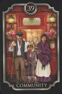
Ciro Marchetti has added three new cards to the traditional 36-card Kipper, bringing the total number of cards in the Fin De Si�cle Kipper to 39. The additional cards are titled Poverty, Toil and Labour, and Community. These cards may sound grim, and they are certainly intended to reflect some of the less idealised aspects of Victorian England (where the deck is set), and our own modern lives. Indeed the artist has invested a good deal of research in creating this deck. He maintains that the essential traditional image of the cards, while giving them a fresher and more vibrant appearance. He also invests each image with appropriate detail and finely nuanced expression.
The cards measure 70 x 105 mm � this makes them a little larger than many Lenormand decks (which they most closely resemble), and a fair bit smaller than many tarot decks� perhaps marginally larger than an average deck of playing cards.
The card stock is superb � strong and sturdy, yet flexible, with gleaming silver-gilt edges. This high quality metallic gleam is made to take constant handling and does not brush off or tarnish as the cards are used. The cards have a highly polished and smooth finish which makes them extremely easy to handle and very smooth to shuffle.
The print quality is superb. These illustrations of finely detailed, and all the subtleties and nuances of these carefully constructed images have been preserved in the printing. The artists palette is naturalistic � these images, but for a few, have their foundation in real life and the artist has gone to great lengths to maintain the sense of reality the images convey. Being Victorian England there is a fairly large amount of earth-based colours - deep browns, mahogany, copper, tobacco, offset with smoky greys, verdant greens and the golden glow of lamps and lanterns.
Being a commercial artist Ciro Marchetti has an appealing and accessible style � idealised reality in its most attractive settings. While some grit and harsh reality has been deliberately included, many of the images are seen through the telescope of time where the disgusting minutia of everyday life has been forsaken. People for the most part look healthy, landscapes are perfectly manicured, interiors cosy, clothing elegant, and smog largely absent. The artwork itself is mixed media including digitally enhanced images.
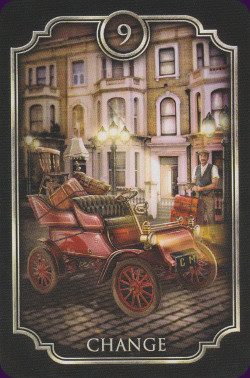
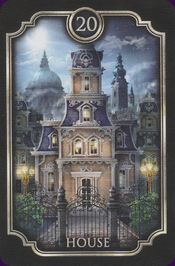
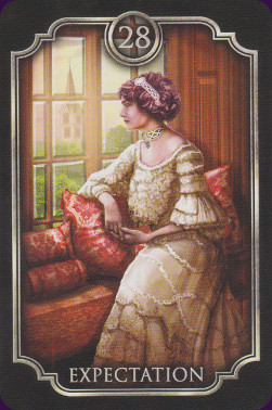
Each image has a narrow and simple border in silvery grey. The card�s number is contained in a disc at the top of the image, and the title is simply printed over the bottom of the picture in plain font. The image on the back of the cards � a chequer-board pattern with an elaborate framework of curlicues surrounding a small harlequin�s mask � is not reversible, however Kipper cards are not intended to be read in a reversed position.
The cards come packaged in a gorgeous little box. The lid folds back like a book cover, and is held shut with magnetic fasteners. The cards and their small guidebook are fitted securely inside. The box has a satiny smooth finish highlighted in silver, with information about the deck printed on the back.
The 83 page guidebook by Ciro Marchetti is both fascinating and extremely helpful when using these cards. The Introduction details the inevitable genesis of the deck from idea to final execution. The artist also outlines some of the choices he made with regard to setting, and details the less than salubrious conditions that were part and parcel of everyday life in Victorian England.
Three experienced Kipper have contributed to the divinatory meanings and descriptions of each card bringing with them their differing views, nationalities, backgrounds, and interpretations. Fortune Buchholtz, Stella Waldvogel, and Suzanne Zitzi also answer questions about how they read Kipper cards, the Fin De S�icle deck itself, tips on interpreting the cards, as well as adding some non-traditional layouts for divinatory readings.
It is about time that the Kipper deck made a comeback and I can think of no finer artist than Ciro Marchetti to usher in this new era. This is a fascinating deck featuring gorgeous artwork that will have broad appeal. If you are a Lenormand reader then you will most likely be intrigued by this deck. If you are looking to expand your repertoire from tarot or Lenormand cards then the Kipper deck is the next logical step in �traditional� oracles. If you are looking for something that is perhaps a little warmer than the standard Lenormand deck then you will probably find what you are looking for with the Fin De S�icle Kipper deck.
All round this is a beautiful, appealing deck suitable for anyone who wants to experience the fascinating world of Kipper cards.
Fin de Siecle Kipper Review by Bonnie Cehovet
The Fin de Siecle is a 39 card deck (3 additional cards have been added to the traditional 36 cards � Poverty, Toil & Trouble, and Community) and 83 page companion book based on the traditional German Kipper system. While maintaining the basic concept and numbering, the visual setting (originally from the Biedermeier period in Bavaria) has been adapted to the Victorian period in London. The deck also incorporates an animated video version of each card, which can be accessed by downloading a specific app and signing up (which is free). Full instructions are included in a downloadable, full color pdf document.
The deck and companion book come packaged in a beautiful cardboard box that opens the long way, and has a magnetic closure. (As often as my cats knock my decks down, I truly appreciate these magnetic closures!)
In his introduction, Marchetti talks about the background of this deck � about his meeting with Johannes Fiebig, from the publishing house AGM-Urani/Konigsfurt/Urania, where they discussed various aspects of cartomancy publishing. One of the gifts that Marchetti was given was a copy of the original version of the Kipper. He was then asked if he would like to produce an updated version of this deck. Initially, Marchetti declined, due to the commitment that such a project would require in both time and effort. However, when he started working with the cards he had been gifted with, he began to see what could be done. In the end, he moved the location from Bavaria to Victorian Britain.
Each card is presented with a small black and white scan, the card name and number, and a short write-up by each of the three contributors (Fortune Buchholtz, Stella Waldvogel, and Susanne Zitzi).
The spreads that are presented are the Tripe Pyramid Spread (by Stella Waldvogel) and the SOS Spread (by Susanne Zitzil).
The end of the book carries information on accessing the interactive application for this deck.
The cards are 2 �� by 4 1/8�, and are of good quality card stock. I love the silver edging � such grace and quality! The card backs have a black border surrounding gold imagery with the image of the face of a Court Jester in the center. The cards are not reversible.
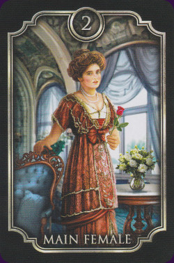
The card faces show the same black border, with the number centered on the top, in gold. The card title is centered on the bottom, in gold lettering. A gold border surrounds the card imagery. The cards maintain a sense of continuity in that elements from one card are also found in other cards (i.e. the paintings seen in the study of the Main Male reference other cards in the deck).
Note: I have chosen to give the explanation from one of the three contributors (all three have contributed an explanation got each card). The need for the contributors has an interesting background � there simply is very little information about the Kipper system in English, so there was a need for knowledge from individuals that were familiar with this system.
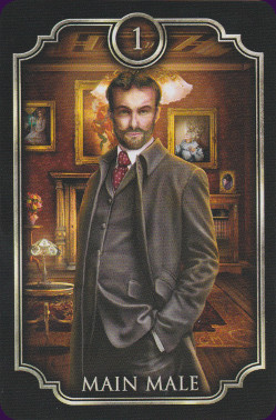
1 � Main Male
(Fortune Buccholtz) �The male significator and co-protagonist of our novel. In keeping with the time, he�s a fine gentleman, a so-called Man of Qualities, and we meet him in his study. Note the paintings in the study refer to other cards. For an opposite-sex reading, he�s the partner of the Main Female, Card 2. In a same-sex reading, he�s the partner of the Wealthy Man, Card 13.�
7 � Message
(Stella Waldvogel) �Informal communications such as letters, texts, notes, memos, phone calls, voice messages and e-mails. (Card 27 is the card for formal paperwork requiring a signature.)�
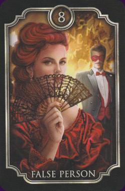
8 � False Person
(Susanne Zitzi) �Don�t trust everybody or everything you see. Even salt looks like sugar. This card warns you against dishonesty and deception. Hold your cards close. Check your motivation and targets too.
21 � Family Room
(Fortune Buccholtz) �Midmorning coffee is served in a bourgeois drawing room, true to Victorian style. The drawing room in better houses was off the formal parlor, and was a place to withdraw to for entertaining close friends and family. Society visits would have been kept in the formal parlor, so we know we�re now in a welcoming and supportive space where secrets and personal matters may be shared. Literally, it�s a room and stands for all private and enclosed spaces such as living rooms, hotel rooms, offices with doors, apartments. More abstractly, it represents privacy and intimacy. This sense of closeness can also refer to the time and place, as in soon, near, right next to you, or shortly, no more than a month.
36 � Distant Horizons
(Stella Waldvogel) �This is a card of dreams and fantasies. The card that follows this one can be a dream (or fear) coming to pass. But is a card is followed by this one, it will remain just a dream for the time covered by the reading. Hopes will come to pass if Card 26 is next to this card. It can also stand for a message from overseas. The timing is usually summer.�
I love the information that Marchetti includes on the background of this deck, and on why the move from Bavaria to Victorian Britain for background. This deck is very good at showing the day to day of life, as it existed in Victorian times. The deck is very easy to use, and a pleasure to read with!
Complete Details of Fin de Siecle Kipper
Creators: Ciro MarchettiPublisher: US Games 2016
Deck Type: Oracle Deck
Cards: 39
Card Size: 2.76 x 4.13 in. = 7.00cm x 10.50cm
Card Language: English
Companion Material: 83 page companion guidebook by Ciro Marchetti is packaged with the deck.
Extra Info: Three extra cards - Poverty, Toil and Labour, and Community.
Rating: 16/20 or
Similar Decks to Fin de Siecle Kipper
Theme: Victorian EraCategory: Tarot Decks With Gilded Edges
Creator: Easy Tarot, Gilded Reverie Lenormand, Gilded Tarot, Gilded Tarot Royale, Legacy of the Divine Tarot, Oracle of Visions, Tarot of Dreams by Ciro Marchetti

< Previous Deck · Back to Top · Next Deck >
Home > Tarot Reviews > Fin de Siecle Kipper Review