Fenestra Tarot Deck Review
The Fenestra Tarot is a pretty deck, with 78 soft, watercolour, almost sepia-toned cards. It roughly follows the Rider-Waite format in the tarot scenes, surrounding them with large, decorative borders. New from US Games.
Deck Type: Tarot Deck Cards: 78
Creators: Chatriya Hemharnvibul
Publisher: US Games 2006
Retailers
See Price at Amazon.comSee Price at Amazon.co.uk
See Price at Amazon.ca
Fenestra Tarot Review by Hemera
Fenestra Tarot is a new deck by the Thai artist Chatriya who is also the illustrator of the Wiccan Cards (Llewellyn 2006). US Games web pages say that her art combines elements of Art Deco, Egypt, mythology and Japanese Manga. And so it does. Fenestra is Latin for �window� and all cards have window-like frames, different in the majors and minors. I am normally not a great fan of frames and borders, because they often seem to water down the artwork (especially if they are white). But here the frames are really an essential part of the whole card and they seem to intensify the power of each card.
The artwork of the Fenestra Tarot excels in beauty. These are probably among the most beautiful tarot cards I have ever seen. There are beautifully flowing lines in Art Deco (Art Nouveau) style with whirling plants, leaves, vines and water. They give movement to the pictures which would otherwise perhaps appear too static. The colours are soft and muted but never too mild or vague. The overall feeling is a bit autumnal; there are lots of yellows and soft reds, beautiful shades of rust, olive and grey.
When I first saw these cards my first thought was �Oh great, another deck showing young/teenage photomodels!� But on closer examination I very soon noticed (somewhat to my surprise) that the people in Fenestra Tarot are essentially ageless. They have an engimatic and magical quality, they seem very mature and they have a serene and direct gaze that I really like. Most characters are very androgynous so even if there are slightly more males than females in this deck (I counted!) gender really isn�t an issue here. Neither is nudity, thankfully! (I have been getting very weary of some of the LoScarabeo nudes recently!)
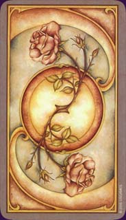
Card backs show a beautiful Art Deco pattern with two roses. The backs look symmetrical both ways, right side up and reversed. There is, however, a tiny text (2006 USGAMES) on the right corner of each card. The text is small enough not to disturb the artwork and yet big enough to be used as an indicator of reversals if needed.
The cards are well laminated and quite glossy, which makes them a bit slippery when new. They will probably tolerate handling well though, and become easier to handle with time. The card size is very convenient; I find them neither too big nor too small.
The cards come in a box which is inside another bigger box. (I have heard that this is to prevent shoplifting?) The big box includes a spreadsheet, with beautiful artwork by the artist and a version of the Celtic cross spread. The Celtic cross is a bit unusual and not particularly good in my opinion (eg. recent past and near future have been swapped which feels both unnatural and unnecessary).
LWB (=little white booklet) is not written by the artist which is always a great pity. It is merely a list of meanings and only the same Celtic cross variation of the spreadsheet is included in the LWB. It would have been nice to have a Fenestra-spread included, as well as at least a foreword by the artist.
I usually hope to find lots of animals in my decks, as animals are great symbols and mirrors of our unconscious energies. There are unfortunately not very many animals in this deck. There are a few horses and dogs, some birds and bulls, but not one single cat anywhere (the odd looking lion in Strenght doesn�t count!).
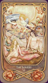
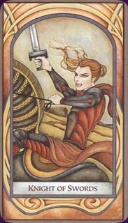
The cards that I personally like most are hard to list since I�d happily frame almost every one of these cards! The Queen of Swords is breathtaking and the Star is among the most beautiful ones I�ve ever seen. It is probably easier to point out the ones I am not really excited about. To mention a few cards where the artist's comment would probably clear things up a bit is the Moon, the Chariot and the World. Why did the artist choose to have two naked ladies in the Moon card? Why not the traditional dog and wolf (& crab)? The deck is otherwise very much the traditional RWS-type. Why is the Chariot (an aggressive male) using submissive and crawling females as the driving force of his vehicle? The World is a bit disappointing. It is the traditional dancing female (goddess) inside a wreath but the female in the centre is very pale and looks shy and sick. She lacks the radiance and vitality that is usually her very essence. I�d also like to ask the artist whether she really meant Lady Temperance to dip her toes in a pool of blood (or red berry juice) instead of water. (And if so, why?)
I can recommend this deck to all, beginners and advanced alike. It is based on the traditional RWS deck so it is easy for beginners to learn. All readers who find the artwork appealing will certainly enjoy the serene beauty of this deck and find it speaks directly to the intuition. I find a special and healing balance in these cards; there is movement and growth but also a strong quality of unhurried listening in them.
Fenestra Tarot Review by pamira
Since I have started reading with my RWS deck, I have been longing for another deck that could keep the fundamentals and the symbolism but offer more depth and beauty in its art and coloring. The Fenestra deck does just that - it is just lovely. I cannot put it down.
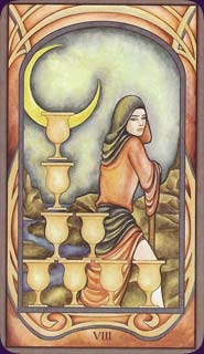
There are a couple of cards, however, that have been altered a bit - I would love to understand why, but no details are included in the package. The Moon, for example has 2 female figures (and the dog/wolf images are gone), and Temperance is dipping her feet in a curiously red body of water... Everything else is so beautiful and spot on, however, that I am able to look past these small deviations. One more thing I noticed was that the children were eliminated from the 10 of Cups - I guess this is a more modern-age deck where a happy, fulfilled family does not require children dancing in the background!
It takes away a little from the imagery if you are used to relying on some of these details, but there are plenty of other details and symbolism to guide one through.
Overall, I think it's a beautiful deck; the art is impressive; the characters are young but timeless, with deep eyes filled with their respective emotions. I'm definitely a fan!
Complete Details of Fenestra Tarot
Creators: Chatriya HemharnvibulPublisher: US Games 2006
Deck Type: Tarot Deck
Cards: 78
Major Arcana: 22
Minor Arcana: 56
Deck Tradition: Rider-Waite-Smith
Minor Arcana Style: RWS-Based Scenes
Suits: Cups, Swords, Wands, Pentacles
Court Cards: Page, Knight, Queen, King
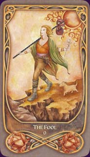
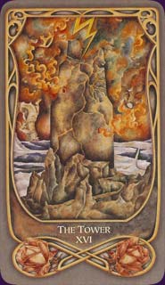
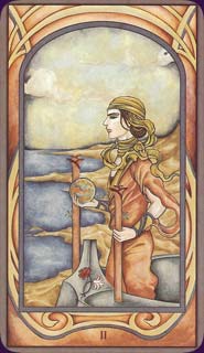
Major Titles: 0. The Fool 1. The Magician 2. The High Priestess 3. The Empress 4. The Emperor 5. The Hierophant 6. The Lovers 7. The Chariot 8. Strength 9. The Hermit 10. Wheel of Fortune 11. Justice 12. The Hanged Man 13. Death 14. Temperance 15. The Devil 16. The Tower 17. The Star 18. The Moon 19. The Sun 20. Judgement 21. The World
The Fool is 0
Strength is 8
Justice is 11
Card Size: 2.75 x 4.75 in. = 6.99cm x 12.06cm
Card Language: English
Card Back: Reversible
Back Design: Mirrored image of a pink rose on a muted blue and reddish coloured curve, and a central circular shape.
Companion Material: Generic little white booklet.
Rating: 18/20 or
Similar Decks to Fenestra Tarot
Theme: Beginner, Rider-Waite-InspiredCategory: Available Tarot Decks
Creator: Wiccan Cards by Chatriya Hemharnvibul

< Previous Deck · Back to Top · Next Deck >
Home > Tarot Reviews > Fenestra Tarot Review